
H4: R Miscellany
The goal of this exercise is for you to get practice working with R in exploring the relationship between numerical variables. Compared to previous assignments, this will be more guided and involve a series of smaller, unrelated tasks. I hope to expose you to different methods of exploring data that may come in handy as you carry out data analysis in your project.
My expectation is that you will go through Task 1 and the reading and introductory code for Tasks 2 and 4 on Monday from 11:10am-12:20pm, since there is no lecture.
Task 1: Go through Ch. 5, R beginner book
Please read through Ch. 5, Introduction to Basic Plotting Tools, from A Beginner's Guide to R, which can be downloaded from here. However, I don't want you to simply skim over what is there. Instead, I want you to follow along and enter the R commands to generate the graphs created for the chapter.
You can download the data used in this chapter from http://cs.wellesley.edu/~qtw/data/Vegetation2.txt. You can also download the code from http://cs.wellesley.edu/~qtw/code/rbeginCh5.r. I strongly encourage you to manually type at least some of the commands, not simply copy and paste everything, since typing in the code will help crystallize the concepts in your mind.
Task 2: Create coded scatter plots for election data
You will create several scatter plots using the Senate contributions data from H3. Please download http://cs.wellesley.edu/~qtw/code/h4starter.r, which includes starter code and some example code to give you hints on what you need to do to plot the following graphs.
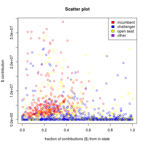
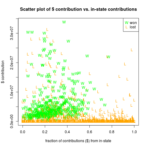
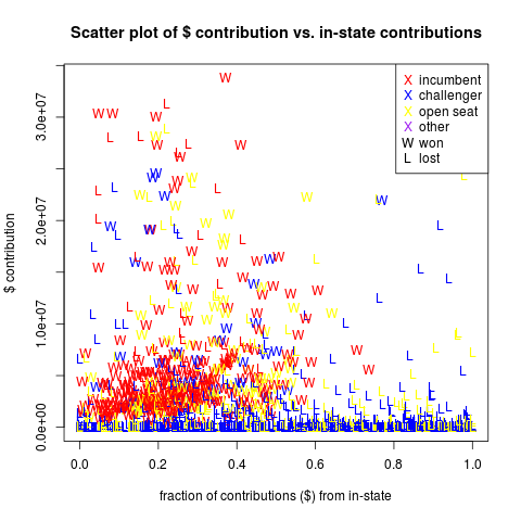
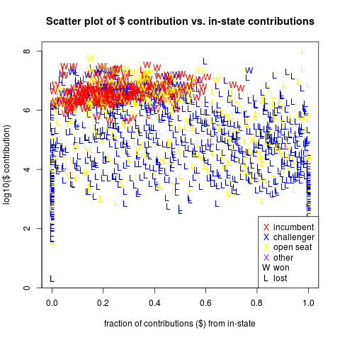
In each of the graphs, you will plot the $ contribution for each candidate against the fraction of in-state contributions received.
For the first plot, called t2_inc.png, color-code the points according to the status of candidate -- incumbent, challenger, open seat, or other (the rare case where the category is an empty string):
For the second plot, called t2_won.png, color-code the points according to who won -- green for a win, or orange for a loss. This time, you should also make the points appear as letters ('W' for win and 'L' for loss). You can assign letters using pch just as for other symbols, but just assign the character to the corresponding data point rather than a number.
OK, so let's review what we've done so far. We're comparing two numerical variables -- $ contributions and fraction in-state -- but then we are also encoding the data points to represent two different categorical variables. We can push the limits of what can be placed on a 2-D plot by encoding one categorical variable using color and the other categorical variable as a symbol. Make the following plot, with wins as W's and losses and L's, and incumbent status as a color. Call the plot t2_win_inc.png:
OK one last step. Notice that lots of data points are concentrated at the bottom of the graph, where the contribution sums are small. We can remedy that by looking at the log (base 10) of the contribution totals instead. This dedicates more surface area to the area of the plot with smaller contribution values. Here is what the plot, named t2_win_inc_log.png, should look like:
Now that you have created the plots, answer some questions about the data.
- What can you say about the prospects of big-spending challengers who rely on in-state funding for most of their contributions?
- What if the seat is open, so that there is no incumbent. Do candidates with lots of in-state backing often win?
- Is it common for incumbent senators to rely on more than 60% of their contributions to come from in-state?
- If someone plans to run for the Senate and plans to raise $100,000 for the campaign, what would your advice to him or her be? Which graph would you show him or her and why?
Include the answers in a document called h4explain.pdf.
Task 3: Box plots based on in-state contributions
Create a factor variable that divides the in-state contribution
fractions into 10 evenly-spaced factor variables (i.e.,
(0,.1],(.1,.2],(.2,.3], ... ) using the cut function. Then plot two
box plots measuring the total $ contributions to a candidate (both in
and out of state) grouped by this new factor variable. Create one box
plot for winning candidates and one for losing candidates. Save the
graph as t3_box.png and make sure it looks like this: (notice that
the y axis has the same limits as the graphs in Task 2):
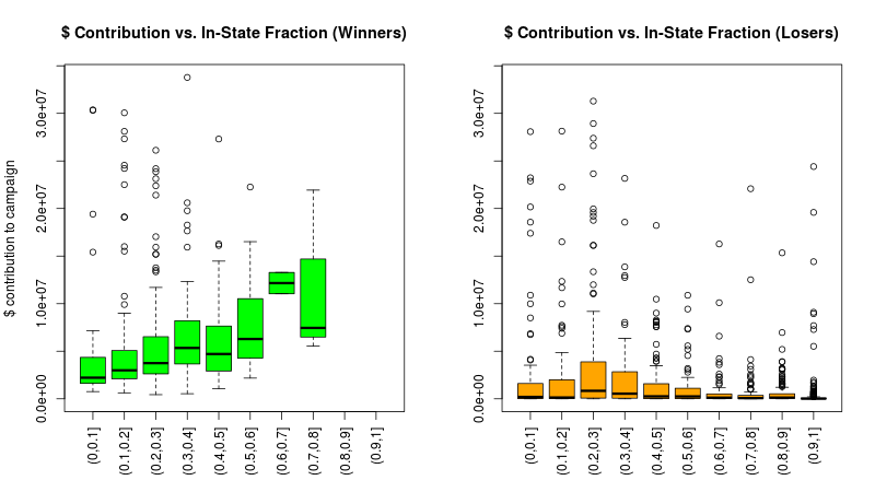
First, in a paragraph of around 4-6 sentences, provide an interpretation of these graphs that could be understood by the lay reader. Include a discussion of any patterns you see that appear meaningful.
Second, in a paragraph of around 2-4 sentences, explain what, if anything, can be learned from examining these box plots that was not as apparent in the plots from Task 2. Include both paragraphs in h4explain.pdf.
Task 4: Creating date variables and time-based plots
R has a built-in Date object that can be handy if your data frame has any columns with dates. Rather than storing them as a string, if you store as a Date object, many R functions will handle the data differently. For example, computing the mean() on a vector of dates will return the average date.
First, you should read Section 4.1 from the R Data book. This can be downloaded from here.
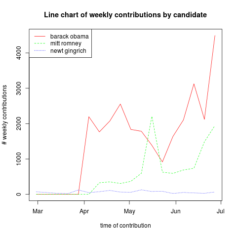
Next, you should follow through the starter R code in h4starter.r. We use data from regular political contributions that you gathered in H2. The example code first creates a bar chart that looks like this:
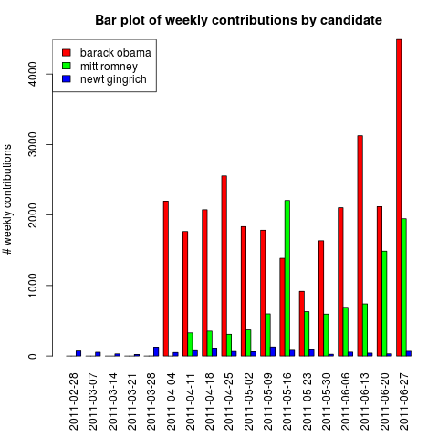
Bar charts aren't really the best way to visually present time-series data, though. The bars make it appear as though each date is not connected to one another. If, instead, we use a line chart, our eyes will naturally follow the progress of values over time and more readily infer trends. Here is the same data from the bar chart, now as a line chart:
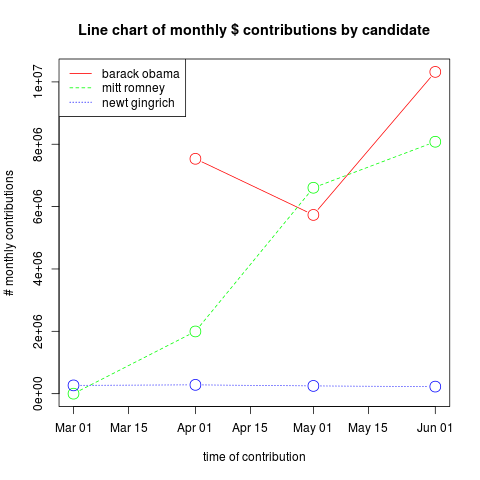
Your task in the assignment is to create a similar line chart, but group by month rather than week, and plot the total $ contributions per month, rather than the total # of contributions per month. Your graph, called t4_month_cont_sum.png, should look like this:
What to turn in
Task 1 is an exercise designed for you to work through on your own. There is nothing to turn in for this task. Task 2 includes some example code you should work through to help you with the rest of the task. Task 4 includes a few pages to read plus some code that you must work through (to create the Figure t4_week_cont_num.png), but that is provided in the starter code. You do not have to turn in anything in for that part of Task 4. You only have to turn in code to create the Figure t4_month_cont_sum.png for that task.
In place of turning in code on these tasks, I would like you to include the statement "I read over the assigned reading and worked through the code in Tasks 1,2, and 4." in the h4explained.pdf file. Of course, only include the statement if it is true!
Include all the code you wrote for tasks 2,3 and 4 in a file called h4.r in the h4/code subdirectory. Include the answers to questions in task 2 and 3 in h4explained.pdf in the h4/figs subdirectory. Include all figures, using names as I indicated in the assignment, in the h4/figs subdirectory. If you work with a partner, you are only required to work together on the parts of tasks 2,3 and 4 where you will be turning in code and explanations.